
the color of possibility

white on white on white kitchen
Color has always trended. From year to year the palette of clothing and interior design lurches this way and that in a seemingly random way. You can clock the shifts with the seasons at your neighborhood Target or Pier 1. The last year or so I’ve noticed the overbearing emergence of a new trend…..white. It is everywhere. In the glossy magazines, the rooms are filled with white furniture. Clients have arrived wanting white marble counter tops on white cabinets with white back splashes to create white kitchens.
Even one of my favorite Blog reads, Jody Brown has picked up on the trend with a recent post on his Houzz.com page featuring the many whites available to architects! To be fair, he also decrees that all architects wear black. It’s about the angst!
I have to wonder why white? Why now? Color always conveys meaning and emotion. The calming influence of blues, the use of greens to symbolize ecological values or the dual nature of yellow representing both caution and happiness. White though? White typically represents purity, cleanliness and sterility. In some cultures, it is the color of perfection, in others death!
Depending on your point of view , white is either the complete absence of color or the visual blending of them all. White light can be broken into a rainbow when shot through a prism. White can represent purity or cleanliness. It also represents the opportunity of a blank paper or canvas. It can even represent a reboot as in fresh beginnings.
In architecture, white is frequently used for its capacity to reveal form. The contrast between black and white is manipulated in architecture to reveal form through shadows. Contemporary Architects are stereotypically said to only recognize white, black and grey as colors. Some of this has been the popular response to the work of iconic designers like Richard Meier. The truth is that most of use appreciate and rely on the rich and varied natural textures and colors inherent in the materials we select to create our works.
Though I can appreciate the crispness of white, the over abundant and inappropriate use of it is driving me nuts. Let’s talk about the current rage for white marble counters in kitchens. This is one of the most inappropriate uses for a material I can think of! White marble stains….easily! Red wine, spaghetti sauce and it is a goner. Yes, you can seal it, but I have never had a client follow up on the recommended resealing. The polished surface will be permanently etched with vinegar or lemon juice. Vinegar is frequently used by the trade to cut the polish and create a honed sample. Another issue with marble, white or otherwise, is that it is a soft stone. It is guaranteed to scratch and show wear and tear. Not something you want to encounter in a surface that requires durability! This is why granite and the man made quartz products have become such popular counter choices.
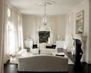
All white living room. This was an interior designers infliction on the living room of a home I designed.
- Taken shortly after original move in. White balanced by color! Trim and other details enhanced by subtle shift of wall tones.

White furniture looks great……….as long as it is rarely never used. Normal use will add a patina to the fabric that will rapidly make it look dingy. Think of a crisp blanket of snow…… after a week. I’m guessing that most of my clients would find this reality undesirable.
This accretion of this patina will be accelerated in an environment that hosts anyone under the age of 30, a dog, or most destructive of all – a toddler with a chocolate bar or sharpie! In an age of everyone using i-pads and tablets, I guess it is possible that people forget the effects that newsprint can have on fabric.
One other little thing, white yellows over time.
Don’t get me wrong, I love and appreciate the look of those images too! That is what they are after all images. Images that come with a promise of a lifestyle attached. The reality is vastly different. Perhaps that is why there is such a resurgence in the use of white at this particular point in time. We all need the optimism and opportunity inherent in a blank canvas!
My prediction for next year….COLOR!

I have very little white in my house and certainly no “off white”. Say yes to color and bold color is even better.
Likewise. I long ago discovered and enjoy the richness and opportunity it adds! A change of color can change the perception of a space. We painted the living room a mid-tone brown and a long time friend came in and asked if we had bought new art! (we hadn’t) It was transformational.
The only benefit of white is that it’s a great background to play up other colors — and allow one to change the overall look of the decor frequently without major re-dos. Think art gallery walls. That said, I love color, especially deep jewel tones. Very little pure white in my home, either.
Color (or lack thereof) is a fascinating topic — thanks for the post.